The Lack of Visualization - Why OKRs Get Buried and How to Make Them Visual (Part 1 of 4)

Objectives and Key Results (OKRs) are a powerful framework embraced by industry leaders like Google, Netflix, and Adobe. With their 5 superpowers of focus, alignment, commitment, tracking, and stretching, OKRs have revolutionized goal-setting and strategic planning.
However, many companies struggle to harness these superpowers fully, falling into common pitfalls that undermine the effectiveness of OKRs. In this four-part series, we will explore the main reasons why OKRs fail and how to overcome these challenges.
The first pitfall we will discuss is a lack of visualization. Without clear and engaging visuals, OKRs become buried in spreadsheets and documents, obscuring what matters most.
Spreadsheets Obscure OKRs from View
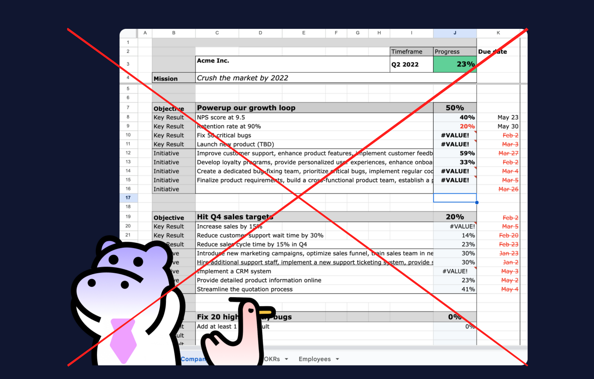
In many organizations, OKRs lack visual appeal and exist only in textual forms like spreadsheets. While spreadsheets are ubiquitous in business, they are a poor medium for strategic goals and visibility. Spreadsheets become bloated documents with small text and no visual hierarchy. Important OKRs get lost among rows and columns of data.

For example, a 50-page Google Sheet with OKRs for the year buried between sales projections, inventory data, and performance metrics quickly becomes ignored. Teams struggle to focus when OKRs are just another spreadsheet tab crammed with numbers and acronyms.
Without visuals, OKRs fail to capture attention and engagement. A spreadsheet row that says "Decrease customer churn from 20% to 15%" lacks the motivational power of a visual chart showing progress towards that goal. Out of sight, out of mind.
When goals and results are hidden in plain text, teams struggle to focus efforts on what matters most. OKRs become disconnected from actual work when they are just words in a spreadsheet rather than interactive visuals.
According to Forbes, employees thrive when their work has clear meaning and purpose. But ambiguous, invisible OKRs in spreadsheets fail to provide that sense of meaning and alignment. OKRs must be visual to enhance the superpower of focus.
The Solution: Making OKRs Visual
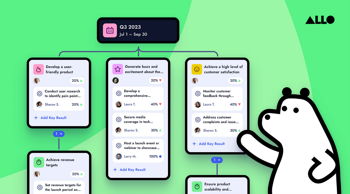
To prevent OKRs from being buried, organizations must embrace visuals and interactivity. Whiteboards and multiple viewing options can transform flat OKRs into insightful, actionable goals.

Tree views, zoomed out maps, and list views cater to different preferences, making OKRs accessible. Clickable objectives and results foster a sense of ownership.
Visualization also enables linking OKRs to everyday work tools like Asana, Jira, Slack, etc. This level of integration is only possible when OKRs are digital and interactive.
Making OKRs visual and dynamic enhances the superpower of focus significantly. With a clear roadmap guiding teams, everyone can align to conquer shared goals.
Visualization Activates the Superpower of Focus
Leveraging interactive visualization allows OKRs to activate their innate superpower of Focus. With a vivid mental map of objectives and results, teams can align and concentrate efforts on shared goals. Static OKRs tucked away in spreadsheets fail to unlock maximum focus. But lively visuals create a shared roadmap to success.
Don’t limit the potential of OKRs by hiding them from sight. Make them transparent through visual tools. This prevents OKRs from being “out of sight, out of mind” and drives organization-wide focus. Activate the full capabilities of OKRs by bringing goals to life with impactful and dynamic visualizations.
Visualization is the first of four common pitfalls that limit the potential of OKRs. In the next articles, we'll explore three more pitfalls that undermine the superpowers of OKRs:
- Engagement - Keeping teams aligned and committed to OKRs over time.
- Connection - Linking OKRs to actual daily work and tools.
- Usability - Making the OKR process intuitive rather than a maze.
By understanding these pitfalls and how to avoid them, organizations can fully activate the superpowers of OKRs. Stay tuned for more insights on harnessing the power of OKRs through engagement, connection and usability.

Next


Learn more:


